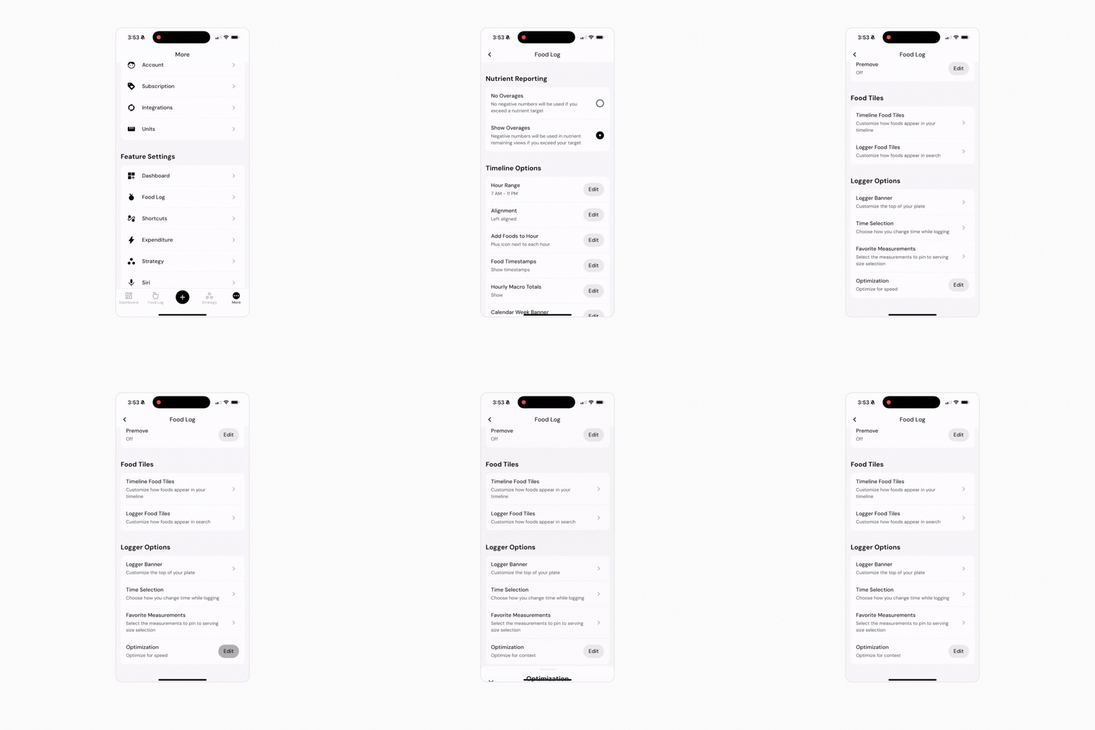
You can extensively customize the food logger to suit your own needs and preferences. To explore all of the food logger customization options, go to the “More” menu, scroll down to “Feature Settings,” and tap on “Food Log.” Once you’re there, scroll down to “Logger Options.”
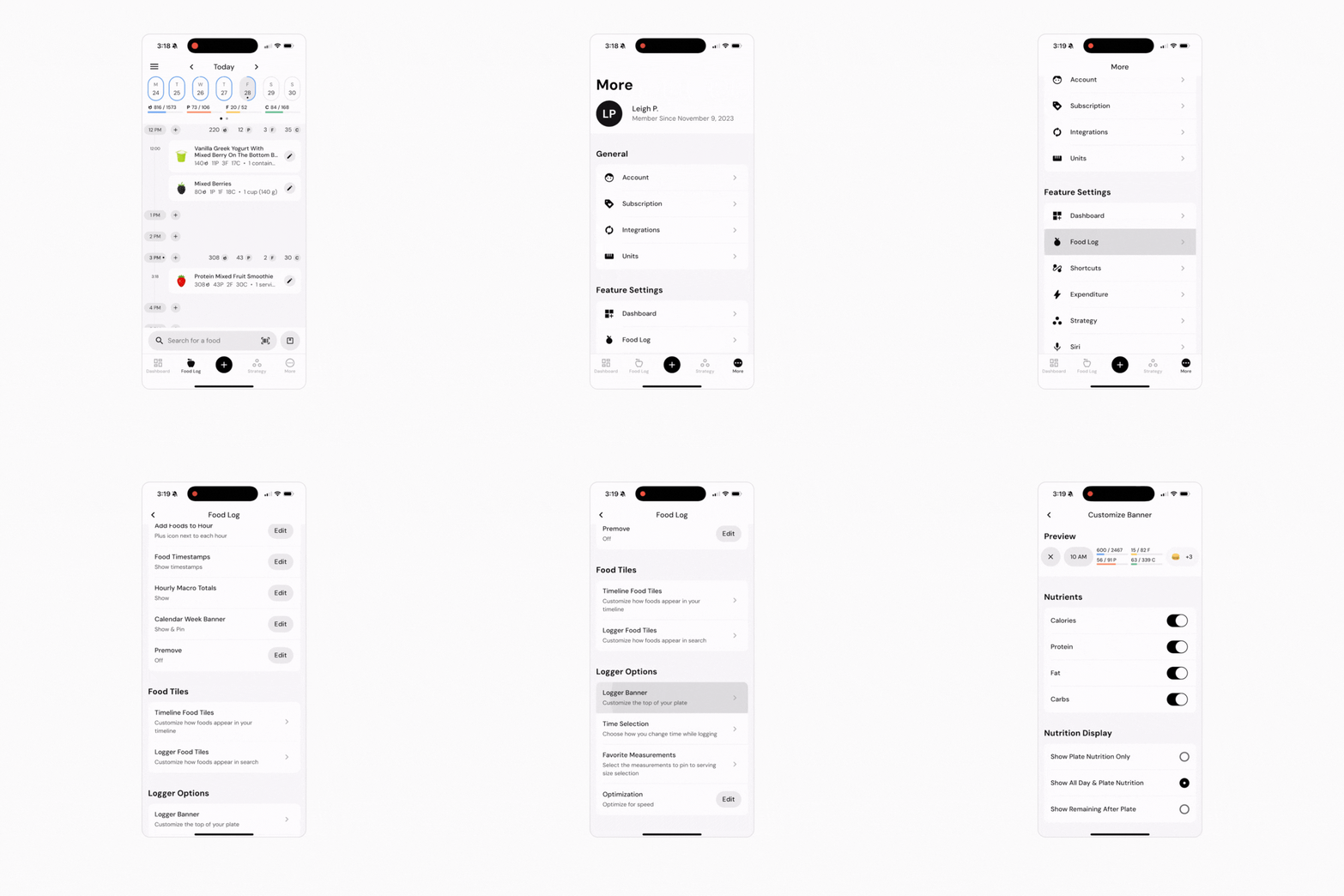
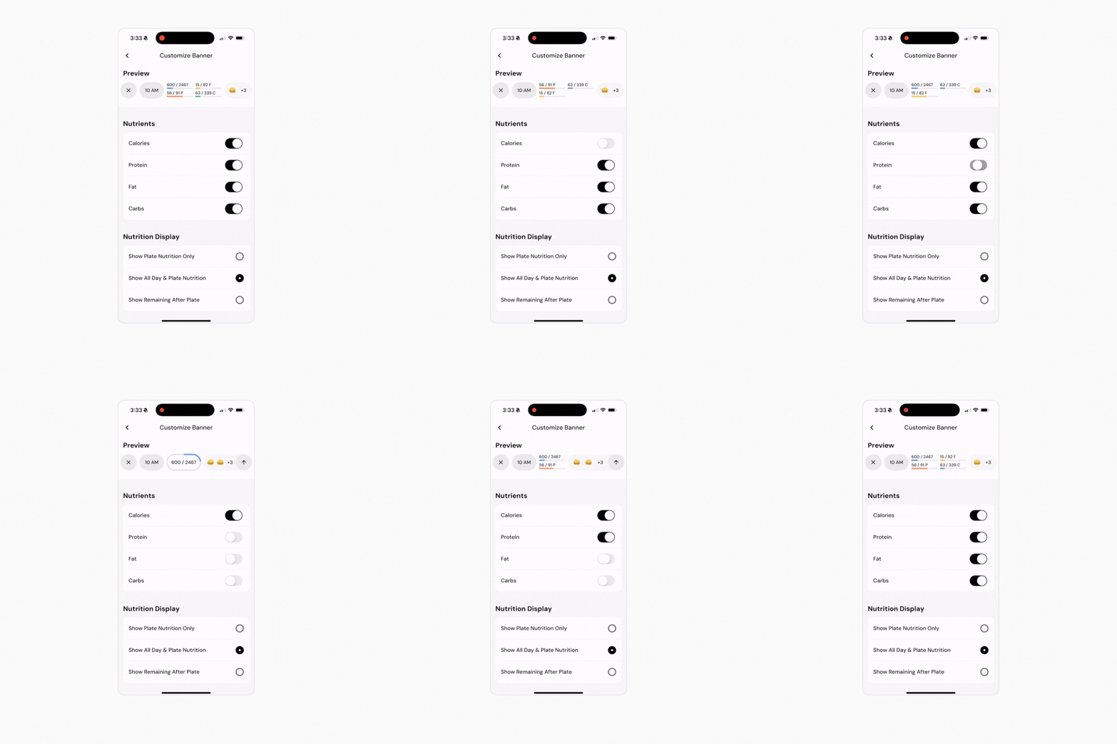
You can customize the information displayed at the top of your food search interface when engaging with any food logging workflow. Select whether you want to enable utilities like one-tap exit and an ever-present date and time picker, whether you want an indication of your plate contents, which nutrients you’d like to display, whether you’d like to see nutrition info for just the meal you’re logging or your entire day, and more. As you experiment with the Plate Banner Builder, your selections will be reflected in the demo banner at the top of the screen, so that you can see the impact of your selections immediately. For more on customizing your plate banner, check out this article.

Favorite weight and volume measurements will be pinned to an easily accessible position when logging any food or beverage that you can log by mass. You can select up to two weight and/or volume measurements as your favorites. Your choices are grams, ounces, and pounds for weight, and milliliters, cups, tablespoons, teaspoons, and fluid ounces for volume.
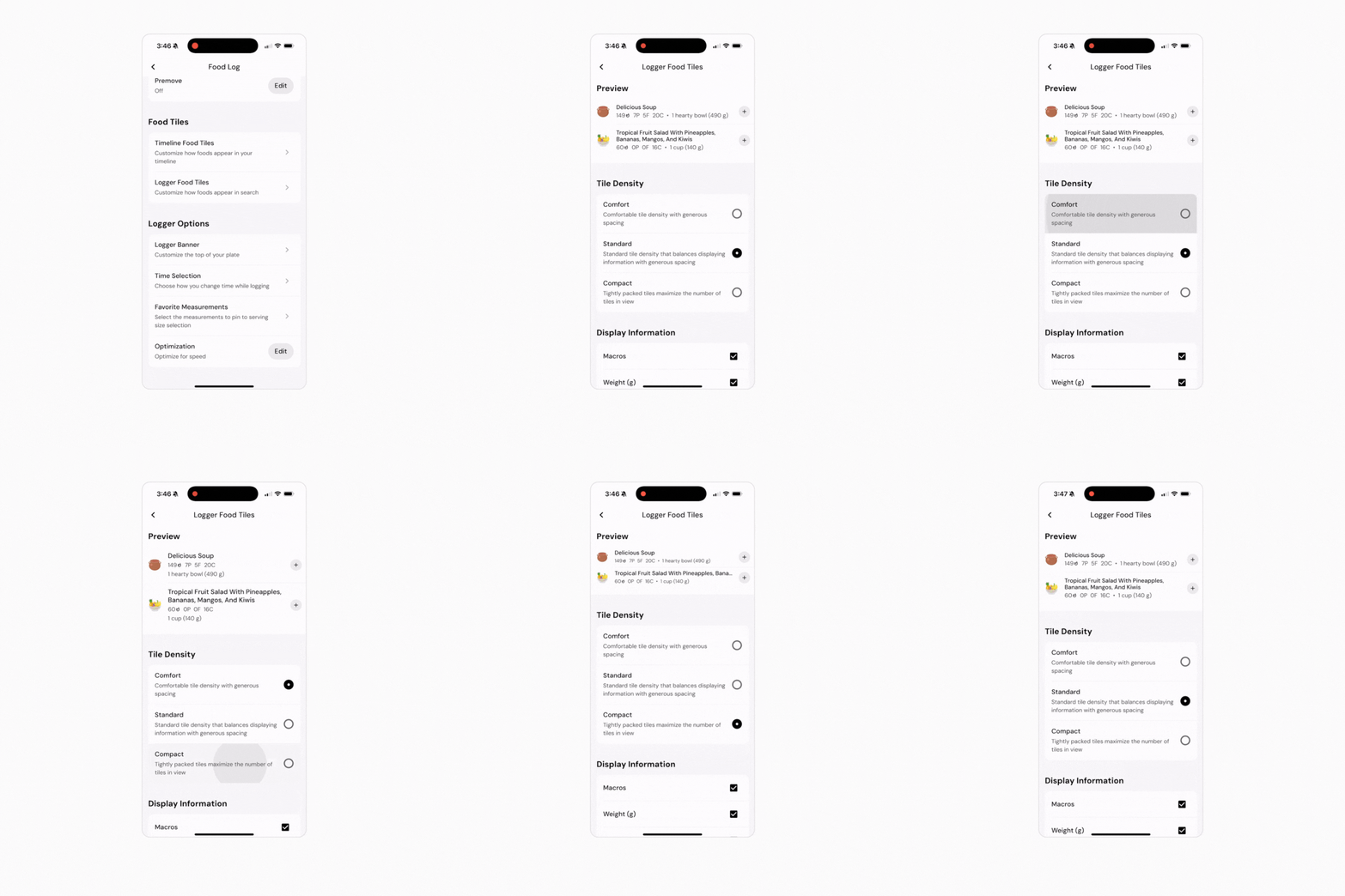
Use the Logger Food Tiles to customize how foods will look in search results.
Tile Density is much like the Food Search Layout options: “Comfort” is recommended for most devices, but it may be worth trying “Compact” if you have a smaller phone.
Display Information options let you customize which information will be present on food search results. Most people prefer to display Macros, Weight, and Serving information, but you can deselect any of these options if you prefer a less information-dense display.
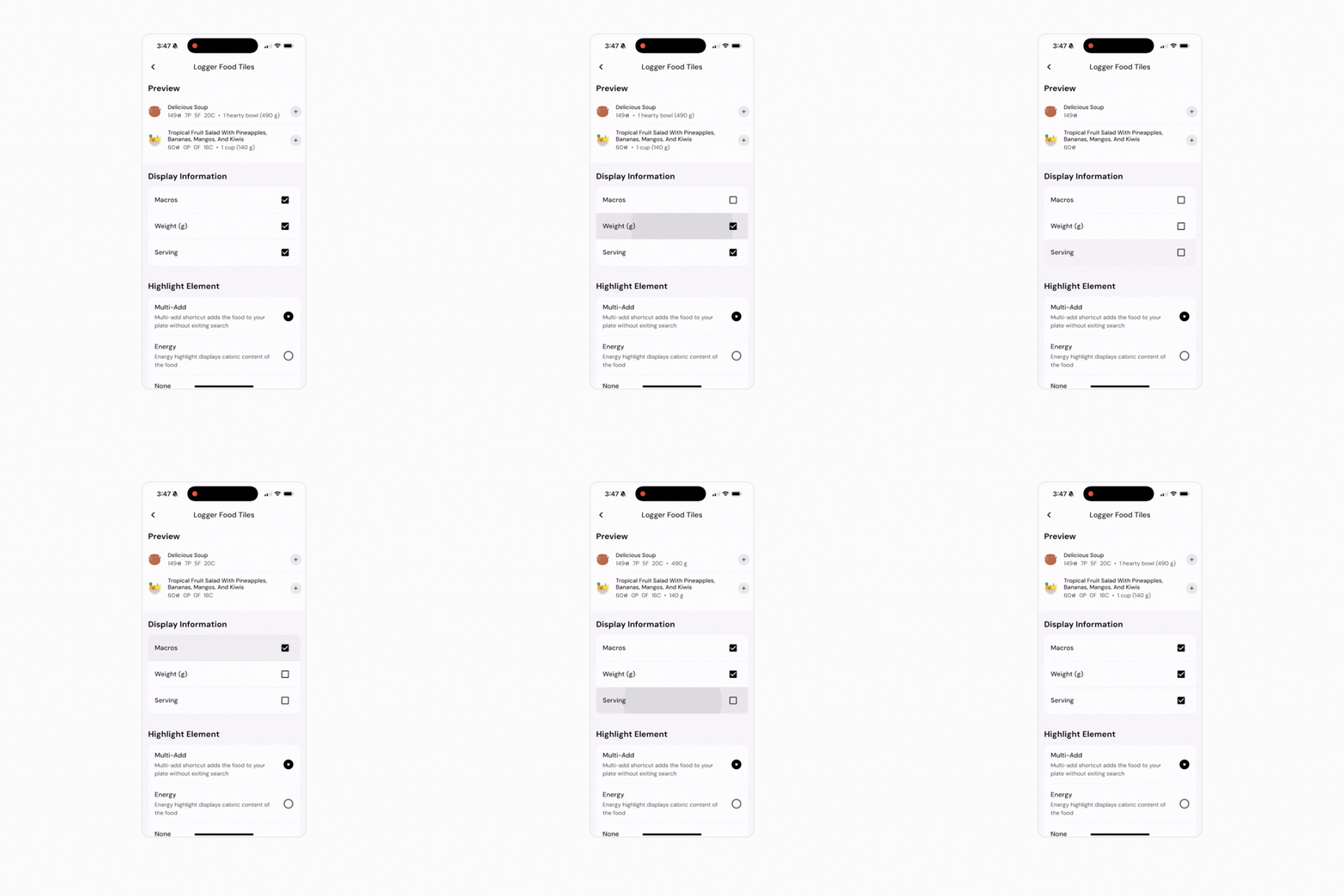
Highlight Element lets you select the element that will show up on the right side of the food tile. Multi-Add is the default, unlocking a lightning-fast food logging workflow. But, if you don’t find yourself using the Multi-Add feature, you could instead select Energy as the highlight element, to make the caloric content of foods a bit more prominent on food tiles. Finally, “None” provides a bit more space for long food names.
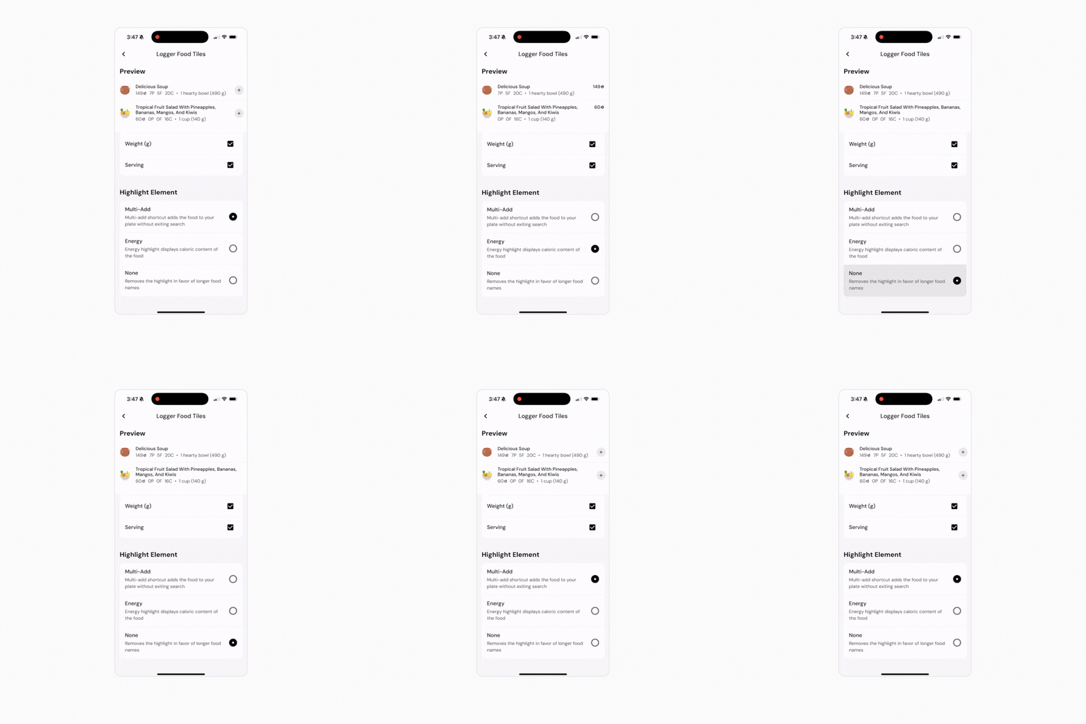
As you experiment with the Logger Food Tiles, your selections will be reflected in the two test foods at the top of the screen, so that you can see the impact of your selections immediately.
Select how you’d like to go about logging foods to different days and times. You can read more about the time logging options here.
“Optimize for speed” is the default option, decreasing friction and allowing you to log foods as fast as possible. “Optimize for context” slows things down a bit, bringing you to your plate after adding each food, so that you can see the impact of each food on the meal you’re logging. You can read more about food logging styles here.
Now that you’ve learned how to configure your food logger, you might enjoy one of these articles next:
How To Configure Your Food Timeline
How Do MacroFactor's Coaching Algorithms Deal with Partially Logged Days?